Showing posts with label research. Show all posts

Wednesday, 14 October 2015

Audience Profile


This is the audience profile of our  target audience. They are 16-25 year old male students as upon research we have found most males like EDM.

Thursday, 8 October 2015

Video Analysis: Calvin Harris


This is a video analysis of Calvin Harris' album '18 Months'. I analysis the front and back cover as well as the CD and a poster promoting the album.

Saturday, 3 October 2015

Music Video Goodwin Analysis: Dillion Francis


 Dillion Francis' music video for 'Get Low'  demonstrates characteristics that within the electronic genre as it does not follow a narrative. However,  the setting of the music video could be seen as unconventional-which is because it does not take place in a party or a club.


A relationship between the lyrics and the visuals is illustrated as both the women and the two artists are shown lip syncing the lyrics 'get low'. In addition, both Dillion Francis and DJ Snake appear in the music video something that could be unconventional in an EDM music video as typically, the artist does not appear in the music videos. 

Moreover, a relationship between the music and visuals is established-which is shown through the women as they perform a dance routine to the beat of the music. 


The women in the music video are used for voyeuristic treatment as they wear tight fitting clothing that show their arms and legs. Throughout the music video there are close ups of their lips and further in the video close ups of the women's backside dancing provocatively for the camera. This could also reflect within Laura Mulvey's female gaze as it can be suggested the women in 'Get Low' are treated as objects for the Dillion Francis and DJ Snake.


Music Video Goodwin Analysis: Martin Garrix

Martin Garrix's music video for 'Animals' demonstrates characteristics that fit within the EDM genre. This shown through the music videos lack of narrative. Fast paced editing and camera shots are used as the music hits it's crescendo- this is conventional within the EDM genre as the use of fast paced cuts and editing could reflect upon the energetic atmosphere of a party or club. Additionally, the majority of  the video takes place in club which is -again- conventional within it's genre.


A relationship between the lyrics and the visuals is illustrated even though there are little lyrics in the song. The camera cuts to a the DJ in an animal mask when the lyric 'animals' plays.


 Moreover, a relationship between the visuals and the music is also established as when the music begins to increase in pace, the camera cuts rapidly between two shots until the beat drops. The relationship between the visuals and the music can also be seen towards the end as the scenes of the group breaking the car windows are in sync with the rhythm of the music.


There are close ups of women throughout the video as they are shown at the club. Close ups of women's  face and of a women dancing with the camera focused on her chest may suggest there is voyeuristic treatment of the female body.


Martin Garrix does  not appear in the music video until the end which is conventional within the EDM genre as the artist is - most of the time - not featured in the music videos. Garrix is revealed after he takes of his animal mask and looks into the camera as the video ends. This follows Goodwin's theory as a close up of the artist is established yet he is not featured heavily in the video- this could be the record label's doing.

Even though there is no intertextual link it can be suggested the song created an intertextual reference as this song was heavily featured on social media websites such as Vine when the song was first introduced to the public.

Thursday, 1 October 2015

Music Video Goodwin Analysis: Galantis


Galantis' music video for 'Peanut Butter Jelly' demonstrates the characteristics that fit within the conventions of EDM. The music video does not follow a narrative instead it features a set of people in a supermarket abruptly revealing their dance outfits under their regular clothing. 
Fast paced editing and cuts is used as the music begins to quicken in pace- this is a convention within the EDM genre which adds to build up and encourages the audience to get excited.


At the end of the video, the people are shown to dance in the supermarket as a group. This is conventional within the electronic dance genre however it could also be seen as uncovenrional as they are not dancing at a club or party. 


 A relationship between the lyrics and visuals of the music video is illustrated. For example, the camera cuts to a mid shot of a cashier surrounded by money once the lyrics 'do it like I owe you some money'.

Additionally there is a relationship between the visuals and the music which is shown through the use of fast camera cuts when the music begins to quicken. This creates a build up and a sense of anticipation and excitement for the audience. 

A convention of electronic music typically does not show the artist's face instead a logo or a distinctive image is used. This is shown in the music video at the beginning and at the end as the camera tracks two people walking wearing jackets with a feline image on it's back. The audience may know that these are Galantis as they are able to distinguish their trademark image as the feline reoccurs in their other works.


Towards the beginning of the music video the camera crabs to the left and follows a woman walking- she is shown to be eating ice lolly which can be seen as a phallic symbol. This could reflect Laura Mulvey's female gaze as further in the music video the woman is shown to dress in little clothing. A mid shot of the woman focuses on her backside and another shot focuses on her body which further establishes voyeuristic treatment of the female body is represented.


As the music video can be seen as random, it can be suggested there is no intertextual reference. 

Tuesday, 22 September 2015

Digipak Analysis: Paramore


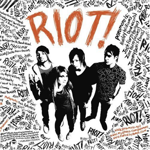
Paramore's 2008 album, 'Riot!' features the American rock band surrounded by the word 'riot'. It can be suggested the layout of the words creates a disturbance for the audience as it is placed unevenly around the sides of the album. The placement of the band in the middle could also suggest they are the people creating the 'riot'. A high angle shot is used, this could connote the audience looking down upon Paramore. This could further emphasis society looking down upon rebellion but the band does not show any sign of caring which is shown through their body language. The lead singer, Hayley Williams, is shown with her hand behind her back smiling at the camera, also the male members are shown with their hands in their pockets nonchalantly as if they do not care. Hayley William's is framed to be slightly in front of the other members, suggesting to the audience that she is more important.

In addition, the band is also in black and white with the only thing shown in colour is the album title which suggests the audience's attention should be solely focused on the title instead of the band. The typography is presented to look as if it is graffiti- this further emphasises the idea of rioting and rebelling. Around the cover, merged with the word 'riot' is information about the band and CD. For example, on the right hand side near the exclamation mark of 'Riot!' the text refers to the members of Paramore. This use of incorporating the different texts with the same typography could make an impact as it is almost hidden within the 'riot' which could further emphasise the destruction the band is going to cause.

Throughout the album, there is a clear colour scheme of orange, black and orange used. This is effective as the orange clearly stands out against black and white and the audience's attention is able to be immediately grabbed with the vibrant colour. The use of orange could also reflect Paramore's image of being a fun, rock band.


The back of the album is similar to the front as it shows repetition of the word 'riot' across the back. The image of the band is once again in black and white yet they are positioned to grab the audience's attention as there is a noticeable contrast between Paramore and the repetitive words in the background. The important text- the track listing- is presented in orange which also catches the audiences attention. The barcode of the album is positioned on the top right corner to which the text also surrounds which could further emphasise the idea of rebelling as there is no blank spaces between the barcode and the text.


The style of the CD is similar to the front and back images of the album which presents the albums use of continuity. 'Riot!' is once again sprawled over the CD repeatedly with the album title displayed in the largest type in orange- this catches the audience's attention as it stands out against the black and white.


Furthermore, the colour scheme is also followed inside the digipak. The lyrics page is solely black and white which further emphasises their  rock/emo image as, stereotypically, black is normally associated with 'emos'. The layout of the lyrics in each song is different, some lyric sections are sideways and some are upright- this could add to the 'riot' of the album and add a sense of chaos. Featuring two of the members on the page, the contrast between the image and text draws the audience's attention on the two members instead of the lyrics. A handwritten, scratched like type is used for the lyrics which could further refer to their genre of music- rock- as this type of text could be seen as threatening and aggressive. 

A special thanks page is also in the album, immediately the audience is left confused at what to look at which adds to the 'riot' of the album and may also create a sense of chaos in the audience's mind. The text is wrapped around each other leaving no empty spaces which may suggest the audience is unable to escape the riot themselves. Orange font is again used to highlight  the important text- such as 'special thanks' - which also gives us a sense of direction as it could serve as a guide on where the audience should look.


The poster for Paramore's 'Riot' follows the same style as the album with the use of black and white images and type with the exception of the orange typography of the album name 'RIOT!'. Similarly, the band is surrounded by the word 'riot' constantly repeating itself across the whole poster- this again creates a sense of chaos as the words are randomly placed on the poster.

Digipak Analysis: Lana Del Ray

Lana Del Ray's 2012 indie pop album could appeal to teenagers and young adults who enjoy her 60s/vintage like image and music style.


The front cover of her album, 'Born To Die', features a medium close up of Del Ray of which only her face and upper body is shown. It can be suggested this use of a close up is an example of Laura Mulvey's Male Gaze, as the artist's costume consists of a white shirt suggesting the artist is simple yet a red bra can also be seen underneath- this could connote a sexy image of Del Ray. In addition, the artist is framed in the centre of the shot, our eyes are immediately drawn to her as she is the focus of the audience's attention. Her minimalistic makeup, hair and outfit could reflect upon her simplistic yet vintage style, also her solemn expression could reflect on her music and could also create a visual style to which her audience will recognise her for.

Lana Del Ray has been pictured outside which could be a typical feature within the indie genre. The use of setting could display her as exploring the world through her music and encountering experiences which shape her to be the artist she is. The colour scheme of the image is bright and fresh which could reflect upon 'Born To Die' being her first album release and target her young audience.

The album uses simple, block typography for her artist and album title. This style is also seem throughout her other proceeding albums and adverts which enables a wider audience to recognise her brand. The artist title is noticeable bigger than the album title which could reflect upon this album being her first therefore it is more important for an audience to see Del Ray's name in order for more exposure. Furthermore, the album title is placed at the bottom, under the artist's chest which further sexualises the artist. A similar colour to her lips is used for the album title which could draw the audience's attention as the bright colour used is vibrant against the soft background.


The back of the album displays the track listings which is- similar to the front of the album- simplistic. This further connotes the simplicity of Lana Del Ray's album. A noticeable feature within the back cover is the drastic change of colour scheme which went from the use of the soft, bright and fresh colours to more bolder colours. The use of a red background could connote Del Ray's femininity- it's colour scheme could also reflect upon the albums emotional themes and lyrics. As the artist's face is not shown on the back of the album, it can be suggested this was used in order for the audience to focus solely on the tracks listed.


The inside of the digipak features a similar image of Del Ray seen on the front cover of the album. A  mid close up is used which allows the audience to focus on the artist's image and body language. This image is displayed through the use of two windows which could show the artist's importance in her image along with her music. Similarly to the front cover, the front cover uses young and soft colours which could connote a natural atmosphere. This contrasts with the boldness of the back cover which could suggest Del Ray is more than what is shown on the front cover and she will continue to show her audience the different sides to her musical image.


Additionally, the inside of the digipak also contains a fold out which consists of the lyrics to each song. A type writer styled typography is used to display the lyrics- this creates a vintage and retro look which could refer to Lana Del Ray's vintage visual image. The paper is also shown to be worn out which further reflects upon the artist's image. Blood splatters are also shown on the lyric pages which could symbolise the artist's relationships and love dying. This use of blood could be compared to the back of the album which is also dark and blood. This could also mark the artist's emotional turbulences in her life.


The CD is simple which follows the simplistic image of the overall album- the use of three roses on a white background makes the vibrancy of the red more prominent and catches the audience's attention. The roses could symbolise the themes of love which could be heavily referred to through Del Ray's music. It's colour scheme of red on white could suggest a sense of innocence and could also refer to innocent love to which Del Ray could have encountered previously.


Digipak Analysis: Deadmau5


The front cover of Deadmau5's album '4x4=12' is very simple yet its simplicity is what makes it effective. The album art consists of Deadmau5's logo of a mouse placed in the centre of the album which draws the audience's attention straight on Deadmau5's logo. The mouse image is presented to be neon coloured- this connotes the idea of being in a club. Additionally, this fits in with the conventions of EDM as this genre is typically associated with partying and clubbing. The artist's name and album name has been positioned on the top of the album. The typography used is bold and simple- this does not draw any attention away from the main album image which could be the artist's intention. In addition, the title of the artist is slightly larger than the album title thus the audience can infer that Deadmau5 is recognisably by both his trademark and unique name therefore the title of his album is not as important in terms of drawing in an audience to buy the product. This is further emphasised as both the album image and the title of the artist's name is displayed in a bright neon colour drawing the audience's attention. However, as the title of the album is in white it can be suggested the audience's eyes are drawn to the album title as it stands out upon the bright neon colours.


The back of the album presents the title of the tracks. The same typography and colour scheme is used throughout the digipak which adds a sense of continuation. Additionally- similar to the front cover- the artist title is presented to be slightly larger than the album title- this further emphasises the importance of the artist's name over the album title as the audience are able to distinguish the artist easily by name and logo.


The album's CD follows the same typography and a similar colour scheme as the front and back cover. Although blue is used instead of green for the logo and typography, the 'club' appeal is still evident as the blue is bright against the black background. Moreover, the use of a black background also draws more attention to the bright neon colours making the club atmosphere more affective.


Digipak: Daft Punk


Daft Punk's album art for 'Random Access Memories' consists of the two members with their trademark masks merged together to create one image. Their names are not on the album as their masks have become their signature look, giving the audience the ability to easily distinguish the act.  The image is positioned in the centre of the shot against a black background this allows the audience to focus solely on the image. The title of the album is written in cursive and is positioned at the top left hand corner of the album- this does not draw any attention away from the main image. In addition, the use of cursive typography could add a personal touch to the album and it can also suggest a sense of timelessness as Daft Punk have been active  in the music industry for a long period of time.


The back cover of the album follows the same style as the front cover, by using a black background and white cursive typography. It's simplistic approach allows the audience to focus their attention on the titles of the tracks. Their record label's information and barcode is located at the bottom, it does not draw any attention away from the track listing and it blends in well with the style of the album.


The booklet that is placed inside the album again follows the same style as the album's front and back cover. On the left, there is a robot inspired image which reflects upon Daft Punk's use of robotic looking helmets which give them the image of robots. The right side of the booklet is full of text noting who contributed to the process in making the album. White typography is used again which stands out against the black background.


It can be suggested the CD does not follow the style of the album. It's bright red colour contrasts with the mostly black and white style of the front and back cover and the contents of the booklet. Around the CD their record label 'Columbia' is presented numerous times with the album title and artist title positioned at the top in black bold typography. As it is positioned in the centre, the audience's attention immediately goes to the artist and album title. However, as 'Columbia' is repeated several times and is slightly larger in font size to the names, the audience's attention could also divert to the record label as they question why the record label is more noticeable than the title of the artist and album.  The track listing is also featured on the CD at the bottom this gives the audience a second chance to view the track names of the album.


The poster for their US tour again follows the same theme as the album art using the same image of their two helmets merged together as the poster's main image. A black and white style is once again used with the only image in colour is of Daft Punk which is able to grab the audience's attention. Their record label is placed at the top  right hand corner while the duo's website - daftpunk.com - can be seen at the bottom of the poster. The names of their supporting acts are written in their respective typography which gives the bands their own identity and allows the audience to easily recognise the acts as the use of different typography makes the names of the acts stand out more.

Digipak Analysis: Calvin Harris


Calvin Harris' album cover for '18 Months' presents Harris in a long shot sitting on a pavement. His body language shows him looking to the right with his hands positioned opposite his face in a clapping motion. The image of the album gives off an urban feel due to the setting being outside yet the overall album cover is simplistic yet affective as this may intrigue an audience. It can be suggested the album title and artist title is the main focal point of the album as they are positioned to be slightly bigger than Harris himself. The audience's eyes are immediately focused on the typography rather than the image. This is could be because the white, simple typography stands out against the urban brick wall. The audience can suggest the album art reflects on the album title - '18 Months' as it can be inferred time plays a large role in the cover. It is said it took Harris 18 months to produce his album- this could be reflected on the album art as the audience can suggest Harris looks as if he is sat waiting for something, possibly for the release of his album. The artist's costume is simple and fits within the colour scheme of the image therefore he does not stand out. However, as he is the only human shown in the art it can be suggested he already stands out against the urban background.

The image of the back cover is an extreme long shot of Calvin Harris sitting on the pavement, similar to the front cover. The artist is looking directly into the camera and to the audience, his body language suggests he is waiting for someone or something which can suggest Harris is waiting for the audience. This use of cinematography positioned Harris slightly off the centre in front of a wall behind a set of houses. The mise en scene of the back cover is a continuation of the style of the front cover using the same simple setting and colour scheme. In addition, a similar typography is used for the track listing yet it is noticeable smaller than the background image. This could suggest the audience should focus on the image instead of the track listing which could be seen as unconventional as the title of the tracks should be large and the main focal point for the audience. Harris' record label information is shown at the bottom left and corner along with the barcode. The position of this information does not draw focus away from the main image and it uses the same white type as the track listing- this allows the information to fit in with the style of the cover.


The CD of  the '18 Months' is different to the images on the front and back cover of the album however, it still maintains it's simplistic style. On a black background, the same typography is used to  label the CD with the album title and artist title. The artist's name is slightly larger drawing the audience's attention to the artist first then the album name. Below  the record label information is displayed, it's small font and placement at the bottom could suggest it is not an important piece of information for the reader.


The promo poster of Calvin Harris for his album '18 Months' displays a mid shot of the artist staring blankly at the audience- which makes him easily recognisable. The type used on his name and album title is larger than the other information which grabs the audience's attention. A list of his popular songs are featured below, informing the audience of what songs they may have heard from Harris. This use of promo further publicises the artist and his music to a wider audience. This is further evident as his album is shown to be 'available everywhere now' displayed at the bottom of the screen in block capital letters. It can be suggested, the style of the poster is different to the style of the album as the image used in the poster looks as if Harris is in a club. This can be interpreted through the use of the bright blue and the shadows suggest an audience is having fun at a club or party shown in the background image.